
TL;DR — THE SHORT ANSWER
A contact form is not an administrative tax audit; it is a door. When you demand eleven answers, insist on a phone number, and slap a cold button that says “Submit,” you lock that door from the inside. Strip the form to four fields. Remove the fear of unwanted phone calls. Promise a generous outcome on the button. If you want connection, make opening the door effortless.
Consider the threshold.
Someone walked all the way down the street, found your shop, paused at the window, and reached out their hand to touch the brass handle.
They want to come inside.
And right there, taped across the glass, is an eleven-point clipboard demanding their phone number, their budget bracket, and their mother’s maiden name before they are permitted to say hello.
What do they do?
They let go of the handle. They walk away.
Not because they lacked interest. But because you made the simple act of starting a conversation feel like filing an amended tax return.
The friction we invent
Most small-business contact pages are engineered for internal convenience, not human connection.
We tell ourselves stories:
- “If they don’t fill out eight fields, they aren’t serious.”
- “We need their phone number so our sales team can qualify them.”
- “We have to know their budget upfront so we don’t waste our precious time.”
These stories protect our ego, but they starve our business.
When you ask a busy stranger for eleven pieces of information, you are not filtering for quality. You are filtering for desperation. The only people willing to sit through an interrogation are people with too much time on their hands. Your best clients—the ones who respect their own time and yours—simply click away.
The $12 million word
Expedia once had a modest, optional field on their checkout form: “Company.”
It seemed harmless. A clean little rectangle on a white screen.
Except travelers thought it meant their bank. They typed in “Citibank” and entered Citibank’s address instead of their home address. The transaction failed. The customer vanished.
Expedia deleted the word “Company.”
Just that. One field erased.
That single deletion was worth $12 million in profit every year.
Every unnecessary box is a tax on trust. The more taxes you impose, the fewer citizens stay in your town.
Five shifts toward generosity
1. The four-question rule
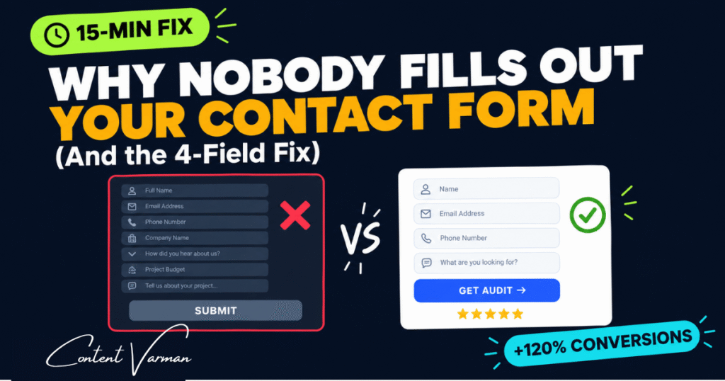
When an agency named ImageScape removed seven fields from their intake form—dropping from eleven down to four—their conversion rate went up by 120%.
Four inputs. That is all it takes to earn the right to a second conversation:
- Who are you? (Name)
- Where do I write back? (Email)
- What are you building? (URL or Organization)
- What hurts? (A single open box)
Everything else can wait until tomorrow.
2. Freedom from the phone call
Requiring a phone number costs an immediate 5% drop in responses.
Why?
Because nobody wants an unexpected sales pitch while they are making breakfast. A mandatory phone field signals surveillance. It tells the reader that an aggressive voice is about to interrupt their day.
Make it optional. Or better yet: leave it off entirely, and invite them to pick a quiet slot on your calendar after they hit send.
3. The language of obedience
Look at the button at the bottom of your form.
Does it say “Submit”?
Look up the definition of the word. To submit is to yield to authority. To surrender. To bow down.
Using the word “Submit” reduces form completions by 3%. Words carry posture. No one arrives at your door wishing to surrender.
| The posture of extraction | The posture of service |
|---|---|
| Submit | Let’s Start the Conversation |
| Contact Us | Request Your Free Audit |
| Send Message | See How We Can Help |
4. Make it easy to read
Design is not decoration. Design is how easily someone can understand what to do next.
- Keep labels above the box: Placeholder labels that vanish the moment you type force the visitor to remember what you asked. Don’t make them remember. Leave the signpost where they can see it.
- Make targets generous: People navigate with clumsy thumbs on moving trains. Give your buttons room to be tapped without effort.
- Contrast: Make the next step visible from across the room. If the button hides, the intention hides with it.
5. Proof beside the threshold
The moment before we step into the unknown is the moment we hesitate.
Ninety-three percent of buyers look for the reassurance of others before making a choice. Hiding your reviews on a lonely page called /testimonials does no good. No one standing at the door is going to wander down the hall to read your framed certificates.
Put the reassurance right next to the handle.
A real face. A single line from someone you helped: “They fixed our problem in two days.” A quiet promise: “No spam. We reply within 24 hours.”
Doubt evaporates when safety is visible.
The choice
| The Bureaucratic Form | The Open Door |
|---|---|
| Demands eleven answers upfront | Asks four simple questions |
| Forces a phone number | Offers permission-based contact |
| Orders the visitor to “Submit” | Invites the visitor into value |
| Hides proof in the basement | Puts reassurance right beside the button |
What to do this afternoon
You do not need a committee meeting or a complete redesign.
Open your editor today.
Delete three fields that you don’t actually need to read today.
Change that cold, mechanical button to an honest, human promise.
And watch how many people walk through the door once you stop locking it.